All posts by CCP karkur

Stay on Target!

Hi my friends in space,

CCP karkur here, back with another super-exciting devblog for you. Last time you heard from me I was on Team Avatar, but I’m now on Team Pony Express; a team that has been tasked with the tall order of improving the EVE players' experience.

We are currently working on a number of things for Retribution, the upcoming EVE Online expansion, but today I'd like to tell you about what we are working on right now to improve your Tactical Awareness.

This devblog is a bit different from those I've written before because we are still fairly early in the development process rather than approaching feature completeness. In fact, as I write this no code changes have been submitted (so let's just hope my computer doesn't crash!). We are just so excited about this stuff and having so much fun with it that we want to share it and start a discussion with you right away.

When you are engaged in combat, whether it's against other clever capsuleers, dumb AI or clever AI, it can be hard to understand who is really hurting you. Of course many of you will have mastered the skill of reading the damage messages in the log (or have such amazing reading skill that you are able read the damage notifications as they flash for a split-second in the middle of your screen) but sadly those messages don't really register that well for many of us.

To be honest, in the heat of the battle, this is pretty much the only thing I get from them:

Yellow text = "I'm glad because I know I'm doing *some* damage"
Orange text = "I don't like it"

One of the things we are working on is to give you a visual indicator of who is dealing the most damage to you. Before I go into how we are planning to do that I just want to stress that we are not telling you who to shoot or making decisions for anyone, we are simply displaying the information that is already available but in a more comprehensible manner.

So how are we doing this?

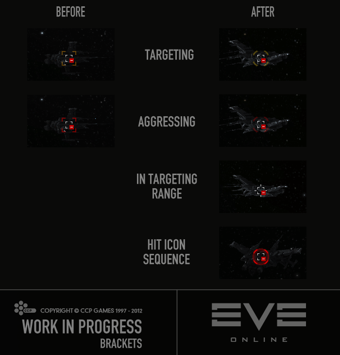
First, to make it all look nice and fit together, we are changing the aggression brackets as well as the targeting UI. Our UI Designer CCP Sharq has made the pretty mockups and we are now working together on making it all come alive in the game client.

Here are screenshots of how it the looks in the client right now:


click image to enlarge


click image to enlarge

Let me now explain to you how we see the damage indicators working:

When someone has you targeted, the new 'yellow box' targeting icon will appear around their bracket. It will blink very subtly (or maybe not at all, we are still playing with it).

When they start aggressing, the 'yellow box' will turn red (but it will still be pretty subtle). However, as the hits start coming in, a new 'hit icon' will flash around the bracket, one for each hit from that pilot. The opacity of the icon will be determined by the damage of the hit. If they are shooting at you with a weapon that has short cycle time but each shot doesn't deal much damage, you will see many faint hit icons, very rapidly. If they're shooting you with something that really, really hurts, the hit icons will be very strong when they flash but you might not see them as often if the cycle time of their modules is rather long.

We have not yet come up with an exact calculation method for the opacity of the hit icon but we are working from this right now:

opacity = hitHP / (ourShieldHP + ourArmorHP) * magic

That is; the opacity of the hit icon will indicate the impact to YOUR ship. If the hit takes a big chunk of your hitpoints (HP), you will see the attacker's hit icon flash strongly even if it was a pretty lousy shot for their equipment.

Another thing we are working on is to allow you clearly see who is in targeting range. We have experimented with many graphics and I think we are about to settle on the very minimalistic 'in targeting range' icon you see in one of the image above. Everything you can target will have this icon added to its bracket, but it will disappear when they go out of targeting range.

We do have more in-space UI changes planned but since we have not started implementing any of them I don't feel that it's the right time to talk about them right now, plus this blog is way too long already!

We will be closely monitoring how our changes impact client performance and will react as needed. And yes, should you desire it we will most likely be offering you a way to turn off the new Damage and Targeting Range indicators.

I just want to reiterate what I said in the beginning that this is very much work in progress!  Therefore you should not take anything I say or show you here as a promise, as it will change as we continue our work in the next few weeks; this is simply what we are trying right now.  

Please give us feedback and we will do our best to answer any questions you might have.

That’s it for now, looking forward to hear from you :)
- CCP karkur

More Skin Color Options

In the upcoming EVE release, Inferno, we will be making changes to characters' skin color.

Don't worry, now is not the time to panic... you will not suddenly change color overnight (or downtime), but we'll get to that later in this blog.

The new character creation introduced last year in Incursion is a very robust system, and we still haven't explored the full potential of it. In Inferno, we are unlocking the ability to set your skin color to a wider gamut of options than previously available. This will allow you to have dark skinned Caldari Deteis, white skinned Minmatar Brutors, olive skinned Amarrs, and basically allow for more diversity within each bloodline. We're doing this because we want to provide more options for each race and bloodline, and mostly, because you asked us to do it!

We are adding 14 new skin colors, and they will replace the old skin colors in the color wheel in the character creator and the resculpting mode of the re-customization. All the bloodlines share the same color options, except the bloodlines with the fairest skin, but they will not have the two darkest options available. That restriction was added because we didn't feel the darkest colors looked quite right on those bloodlines. Don't worry though; there are still dark colors available for them.

The 14 different colors are not just a gradient between white and black. Our artists tweaked each color to represent some of the different hues you would find throughout the continents of our world. Each bloodline has a default skin color, but after a new character has been spawned in the character creator, you are free to choose any color for your character's skin.


Click image to enlarge


Click image to enlarge

In order to allow all players, new or old, to take advantage of this skin color change, we are going to give you all something we call a "free resculpt". A resculpt of your character is a special re-customization mode you can go into, where you can not only change your character’s clothes, hair, and pose, but are also able to change attributes that otherwise can only be defined when creating a new character. This includes the bone structure of the face, body weight, and skin complexion.

We have given these resculpts a few times before, and some of you are probably clever like me and have been saving it for a rainy day. Well, in case you didn't know, these resculpts don't stack, so after Inferno's deployment everyone will have one, and only one, resculpt left.

So what happens to your existing characters? Nothing, unless you want to change them. I hate when I go to sleep and wake up only to find that I've changed colors overnight, and we figured that you might feel the same way. Therefore, you will not all change colors during the Inferno downtime and will not be forced into using one of the new skin colors. If you want to keep your current skin color, just leave the skin color wheel be when you re-customize. If you do pick a new skin color and then finalize the character, you will be using the new skin colors from that point.

You are of course free to try out the new colors and see how they look on you and then back out of the changes by either exiting the re-customization without saving or by using the history slider at the bottom of the screen to go back.

With this skin color change, we are also lifting hair-color restrictions, allowing you a greater selection, regardless of your bloodline.

We hope that you enjoy this small addition to the character creator and that you have fun resculpting and tweaking your character to look just right.
- CCP Karkur and CCP t0rfifrans


New to EVE? Start your 14-day free trial today.
Returning pilot? Visit Account Management for the latest offers and promotions.

U and I – Our Little Improvements Together V2

Hi spacefriends,

I am back to tell you about a few little things my team and I are bringing you in The Escalation to Inferno.

Some of you might remember my first devblog, U and I – Our Little Improvements Together, which was published a few weeks ago. The comment thread was very positive and helpful, and I want to thank everyone who participated for the warm welcome! The discussion was constructive and it was fun collaborating with you guys and the overall positive attitude was very motivating. You guys had a lot of great suggestions, and in fact, many of the changes I'm here to tell you about were suggested in that thread.

Continue reading U and I – Our Little Improvements Together V2

Ewareness for DeBuff-alo Soldiers

Hi everyone,

I wrote my first devblog a few weeks ago and you were all so nice that I figured I should write another one... plus I actually have stuff to tell you about.

I think we have all been webified or ewared in one way or another. To be honest, the whole thing is very confusing for a noob like me. I have lost a few ships because I had no idea that I was being warp scrambled and when I finally realized it and tried to find the attacker in the overview, it was too late. I'm sure some of you more experienced players have also had problems finding who the heck was ewaring you.

Continue reading Ewareness for DeBuff-alo Soldiers

U and I – Our Little Improvements Together

Hi everyone,

I'm CCP karkur, and I'm here to tell you guys about a number of Little Things my team, Team Avatar, is bringing you in the next point release. But first let me introduce myself:

I'm a UI programmer and I've been with CCP for almost 4 and a half years, yet this is my first dev blog so please be nice :). During my time here, I have worked on various features and systems, including EVE Mail and the Skill Training Queue, and also fixed A LOT of bugs (I know... bugs? In my EVE? Never!). Most recently I've been working on our lovely Character Creator, which is something I really enjoy :)

Shortly after the release of Crucible, CCP Soundwave posted a thread where he asked you for all your little things. That thread is now over 100 pages, and I spent a few nights reading over a lot of your posts (wow, you guys write a lot) and wrote down all the small UI suggestions that I found interesting and thought would be fairly easy for me to implement.

Then, on a beautiful Sunday evening, when I had compiled a long list of your ideas (both from that thread and other threads) and prioritized it, I fired up the client and my awesome TextPad, and started trying out stuff to see how much work was needed to take the changes all the way. I might even have implemented a few of them right there and then, but as all changes like that need to go through the proper channels, the team planned them in our next planning sessions, and then the final touches were made.

Anyway, you are probably more interested in what we are actually bringing you than all this blabbering... so let's get to the good stuff:

A number of you wanted to be able to drag a blueprint over to the Quickbar and get a folder with all the materials needed for that blueprint.

When I started implementing this, I felt the ability to drag inventory items to the Quickbar was sorely missing, so I added that first. Then I found that there was a small problem with non-market items, as they were not allowed in the Quickbar. Wouldn't it be nice to be able to bookmark such items to do "Show info" on them later, or search for them in contracts? Well, now you can add them like any other items, by dragging them over to the Quickbar or by using the right click menu. They will be greyed out so there should be no confusion why you cannot load the market details for them.

Speaking of contracts... when I had added the non-market items to the Quickbar, I realized that I should probably make it easier to find stuff in contracts from the Quickbar, so I added proper menus to the Quickbar items.

Click to enlarge

Sooo, back to the original task... the blueprint folder. Now you can just add the blueprint to the Quickbar while holding down SHIFT, pick the job type, and then, voilà, a folder that contains all the stuff you need for that job as well as the blueprint itself is created in the Quickbar!

Click to enlarge

One of your ideas that I really liked was to highlight the market orders that are in your route. So now, the text in the orders that are in your route will be colored yellow.

Click to enlarge

You asked for the ability to sort your orders by region, so an extra column, "Region", has been added to those lists. The column that used to be called "Location" has been renamed "Station".

Click to enlarge

Then when you asked for a "Show Market Details" button in the "Modify Order" window, it just made so much sense that the button had to be added.

Recently a player on the forums discovered an awesome new tool, the Compare Tool. Well, it's actually been around for years, but I still managed to convince a few people that it was brand new, and tried to take all the credit for it. My friends in that thread asked for a shortcut for it, so a shortcut they get :) An optional button for the Neocom will be added soon when an icon for it has been made.

So, you know how when you do "Show info" on a solarsystem, you get a route tab that lists the solarsystems you must go through to get there? Well, currently the list does not give you a whole lot of info on how dangerous that route is, but soon it will, as you will have color coded security level in front of the systems' names, and also text that tells you how many jumps are in the route.

I personally hate it when I'm writing a long fan mail to CCP Punkturis, and I'm just about to get to the good stuff when I realize I've reached the character limit... how I wish that I had something to give me a hint on how much more I could fit in that mail! Based on your forums posts, I'm not the only one running into this, so I added a character counter to Mail, Bio, Notepad and other similar text fields.

(You will notice that the Notepad counter behaves a little bit differently than the rest, as it also counts the invisible tags you add, but that's because the Notepad is very strict on its character limit.)

Other small changes you asked for:

  • Sort order of "number of items" in your asset window has been changed, so now the stations with the most items will be listed first, instead of all the hundreds of stations where you only have a rookie ship or some other not-so-interesting items
  •  "Show info" is now in the right click menu of someone who is chatting
  • Right click menu has been added to the image in the "Selected Item" window
  •  A non-useless right click menu has been added to the materials in the reactions' "Show Info" window

I hope you like all these small changes and I hope we can continue making small improvements like this on the side, because we do have a long list of stuff we want to change and fix and improve for you :)

That's all for now. Until next time, fly safe! :D

- CCP karkur
 

Catch CCP Karkur and the rest of the UI gang at Fanfest 2012 where they'll be hosting a roundtable! More information on Fanfest topics, tickets and travel can be found here.

New to EVE? Start your 14-day free trial today.
Returning pilot? Visit Account Management for the latest offers and promotions.