All posts by CCP karkur

Little Things in Kronos: The Changes and Fixes You Asked For

CCP karkur here.

First of all I want to thank you who came to the roundtable CCP Punkturis and I held at Fanfest. We were very pleased with the session and found it both helpful and very motivating for our "Little things" effort.

Now on to the little things coming in the Kronos release!


Reload and Repair Timers

A bunch of you have told us that that seeing the progress of charge reload and module repair while in space would be very useful. We have wanted to display that information for a while, but finally dove into the needed work now and are delivering this functionality to you in the Kronos release on June 3rd.

After thinking a bit about how to best represent the progress, we decided to utilize the user interface elements already there and keep it very simple:

  • The Reload Timer uses the Cycle Timer, except it goes backwards as charges are being loaded.
  • The Module Repair is visualized by "eating up" the current damage displayed on the module. At first you might suspect the repair animation is not working, but be patient because it just takes a long time to repair modules.


Collapsing Windows

Have you ever misclicked in the Selected Item window, collapsed it, panicked and lost your ship as a result? No, me neither; but for those of you who are maybe not as amazing at clicking as I am, we have changed the collapse functionality of all windows so now they are only collapsed if their header area is double-clicked, and not if any empty space in them is double-clicked. Don’t worry, you can still drag windows around by grabbing any empty space.

I hope that will save you a few capsules and ships.


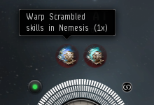
Warp Scramble in Effects Bar

When you get into trouble with some bad guys, it's pretty valuable to know if they are warp scrambling you or warp disrupting you considering the differences between the modules and their ranges. We all know that, so it was about time to separate those two things in the Effects Bar and give you the information you need as you scramble for your life (yeah, I know, I also want to pod myself for that pun).

Protip: Did you know that you can target the closest pilot applying each effect by CTRL-clicking the icons in the Effects Bar?


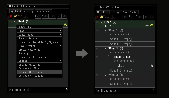
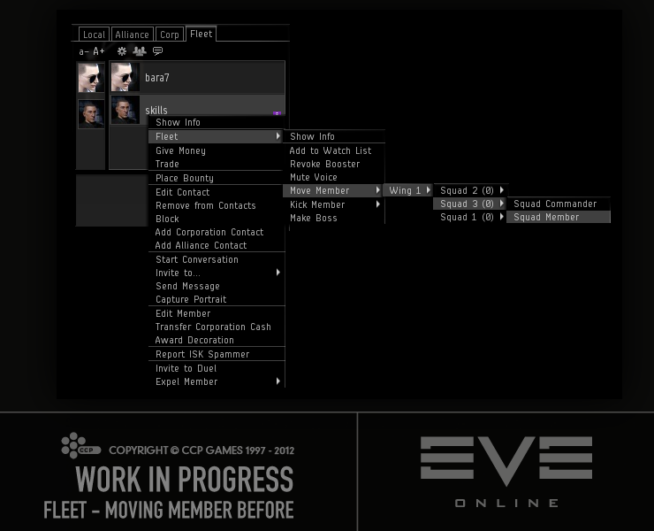
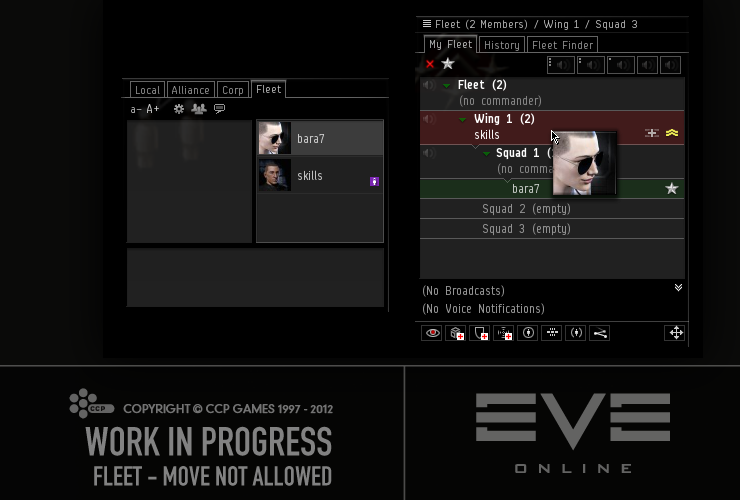
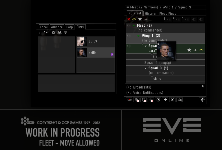
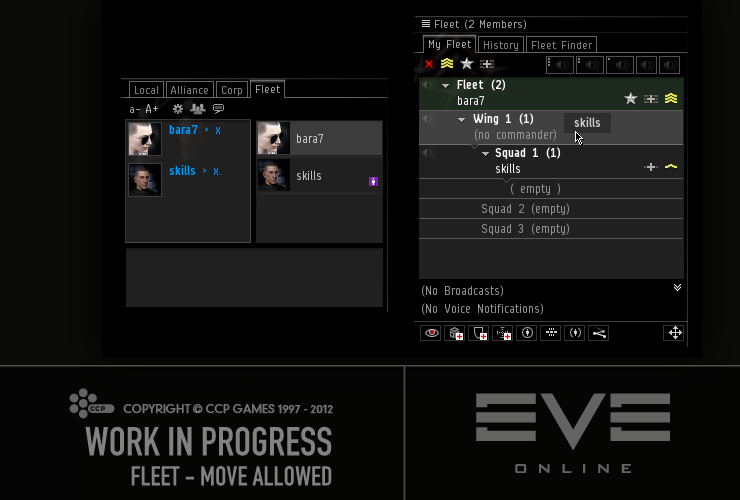
Improvements to Fleet-related Things

Our logistics pilot heroes deserve some help every now and then, don't they? That's what we felt, so we are adding the ability to color-code fleet broadcast types in the Fleet History. This has been a common request from a number of New Eden's logistics pilots. By default the broadcasts have no color, but a color can be assigned to each of the broadcast types through the Broadcast Settings window.

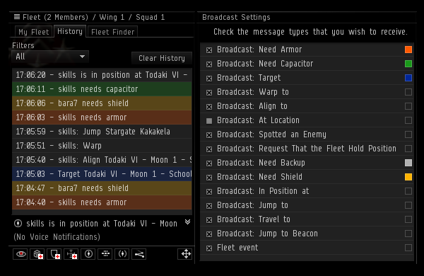
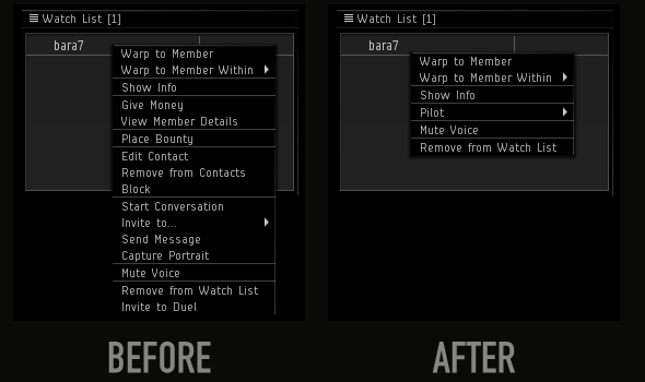
Another thing we are adding for our logistics pilots is the ability to clear the Watch List of any broadcasted icons, so when going into a fight they can start with a clean slate rather than some random old "Travel To" broadcasts cluttering the Watch List. This is done through a menu option in the Watch List's header.

While working on the Watch List I noticed the content of it would sometimes flicker on broadcasts, so I fixed that and hope you'll have a better behaved Watch List now.

We know a lot you fleet commanders run the same Fleet Advert again and again and again, and need to fill out the form every time when creating them. We decided to make it a little easier on you by preloading the Fleet Advert form with the name, description and settings from the last Fleet Advert you published. If you want to change any of the settings or text, you are of course able to do so.

We also made a small change to the Fleet Adverts so now double-clicking an advert in the Fleet Finder will attempt to join the fleet so you don't have select the advert and click the "Join fleet" button


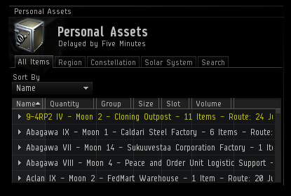
Highlighting in Personal Assets

A while ago we added yellow highlighting to market orders to show which ones were at a station in a solarsystem on your current autopilot route. You have asked us to do something similar for Personal Assets and, when noobing around on Tranquility, I too have often really wished it was a thing. So in the Kronos release we are delivering that to you. An added bonus is that now you can drag the stations from Personal Assets and link them in chat.


Target Indicators in Survey Scanner

I sometimes take my shiny Retriever out for a bit of mining. As probably many of you do, I run my Survey Scanner to find big asteroids, and then run it every now and then to see if my rocks are close to depleting. What makes it a bit tedious is that all the asteroids have the same name and I need to click on them to see which ones are targeted. I want to reach my True Miner Potential so this was an issue that had to be resolved!

We have therefore added targeting indicators in the Survey Scanner on the asteroids that you have targeted at the time the scan finishes. Those indicators are not removed if the asteroid is untargeted later, as they behave like the other information in the window, which is a snapshot of the situation at the moment the scan finished.


Kill Report Filtering

We have added a filter for the Kill Report lists, both in the personal list in the Character Sheet as well as the list in the Corporation window. This filter will try to match your input text to the beginning of a report's ship name, victim name, corporation and alliance, and if none of them match, the report is not displayed in the list.

It's worth stating explicitly that this is not a "search" that will search all the reports, it's a filter for the current page of the list.

While I was at it, I fixed the issue where the list would sometimes stutter when it was loaded, so the experience should be smoother now.
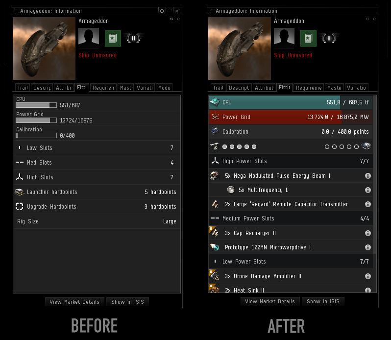
 

Info Window Cleanup

In recent releases we have been cleaning up the Show Info windows little by little. In the Rubicon expansion we grouped the four damage resistance attributes for shield, armor and structure (hull) for ships and drones, giving you a cleaner and more consistent view of them. In the Kronos release we continue with that work, and now we group the damage types, sensor strengths, as well as other resistance attributes for all items, making them easier to read and reducing the clutter in the Show Info window.


Other Things

Other things you've asked us for and we are happy to deliver to you in the Kronos release:

  • Targets can now be locked in place so they cannot be dragged around. This is done through a right-click option on the Target Origin.
  • The Jump Clone locations in the Character Sheet have been given a proper right-click menu, allowing you to set the autopilot destination from there.
  • The "Plug In" right-click option on implants has been promoted to be below the "Show Info" option.
  • It's now possible to drag some chat channels from the Channels window to any text field to create a link from which people can join the channel. Channels such as corporation, alliance and solarsystem channels cannot be linked.
  • Characters and other entities can now be dragged from the Channel Settings window to be linked in chat and other input fields.
  • If a corporation has no war history, it will say so in the "War History" in the corporations Show Info window, so you no longer have to wonder if it's just taking the war history a long time to load.
  • Paths starting with "http://" or "https://" can now be linked in the "Generate Link" window.
  • Hyperlinks will now show the web address (URL) in a tooltip, making it harder for mean pilots to trick innocent and unsuspecting pilots into clicking questionable links masked as something else.
  • Incoming conversation requests are now logged in the "Notifications and Logs" window.


And that’s it! Hope you enjoy these changes :)

-@CCP_karkur of EVE’s Team Pirate Unicorns

U and I – Through a Scanner Lightly

Greetings fellow capsuleers! 

CCP karkur here with CCP Merc from Team Pirate Unicorns to tell you about some little side projects we have been working on lately, which we are delivering to you on 12 March in EVE Online Rubicon 1.3.

Directional Scanner Changes

A lot of you have asked us to improve the range input in the Directional Scanners. Currently you can only enter the scan range in kilometers (km), which is maybe OK if you are so lucky to be able to convert between that and astronomical units (AU) on the fly. However, most of us struggle with that conversion, to the point where many pilots have resorted to listing this chart in their bio for easy reference. It can make scanning quite tricky.  

We have heard your pleas (and done some begging and crying ourselves), but we have much more ambitious ideas for the scanner. So we have, to be honest, been a bit reluctant to just put a tiny patch on it.

But the CSM raised the issue once again at the recent CSM summit, and CCP Delegate Zero suggested that we finally should do something about it. After getting great support from our scanner friends in Team Five-0, we decided to stop pushing back and just go for it!

As of Rubicon 1.3, you will have three ways to enter the scan range: one slider and two input fields (one in km and another one in AU). Those three input options will be interconnected.

That means that when you enter “100,000” in the km field, the AU input field will display the corresponding distance in AU, and the slider, which is linear, will also update.

The slider can be used for input as well, and snaps to 5 predefined values (1 million km, 1 AU, 5 AU, 10 AU, and the max value 14.3 AU). Those presets, along with that fact that a directional scan is performed when you let go of the slider handle, will allow you to perform "short", "medium" and "long" scans super fast, which can be very handy to get a general idea what’s present in a system you jump into.

When you used the input boxes to set the range (useful for some more fine-tuned scanning), you will either need to hit “Enter” or click the "Scan" button to fire off a scan.

We also know that many of you have found it very difficult to work the linear scan-angle slider, since 5 out of the 7 scan angles occupy the first quarter of the slider’s length (a whopping 20 pixels!). We wanted to make it easier to use, so we changed the slider so it's no longer linear. Now there are seven evenly spaced increments representing 5, 15, 30, 60, 90, 180, and 360 degrees. We also added a cute little pie chart next to it that will help you visualize the coverage of the selected scan angle.


You can see the Rubicon 1.3 D-scan window below.

Additionally, after Rubicon 1.3, you will be able to click anywhere on the two sliders to have the slider value set to the closest available value, or use the mouse wheel to move the slider to the next tick in the slider. You will also find the slider handle is less fiddly to start dragging.

Word Filtering and Highlighting in Chat

We know how busy chat can be, and many of you have asked us for a way to highlight certain words in it. When our GMs asked us if we could add the ability to filter out words, I saw the perfect opportunity to feature-creep a bit and add word highlighting as well.

We decided to keep it very simple for now: Open the Word Filter window from any chat channel and add the words you never want to see in the chat in the first input field, and the words that you want highlighted in the next input field. There is also an option in that window to have the highlighted words always trigger a blink on channels, even though blink might be turned off for that channel.

Filtered words will appear as three asterisks (***) in the chat, and highlighted words will be displayed green and bold. This reformatting of the chat messages is all done client side, so you will be the only one affected by your word filters and highlighting. Also, word filters are stored on the server per pilot, so you won’t have to redo them if you play on more than one computer or happen to lose your client settings.

We’re quite interested in seeing how you will make use of the chat highlighting, but expect that many will choose to highlight their pilot names and nicknames. Some fleets or corporations might also instruct their pilots to highlight predefined keywords (such as “squad4”, “allBombers”, “SquadCmdrs”, etc) to grab the attention of relevant people. One of the things we love about the EVE Online community is your ability to find brilliant ways to use the game’s features, and I suspect you will come up with something for the highlighting which we had never thought of.

Changes to Notification Settings

Have you ever wished that you had more control over which Notifications make the Neocom button blink? Want to get a popup when your corporation has been war decced, but not on every bounty payment you receive? If so, you’re in luck, because we are adding the ability to set the Notification options on a group by group basis.

Similar to the chat filters, these settings, as well as the mail settings, will now be stored on the server, so they should apply to any computer you play on. While we were at it, we added a notification group for Insurance.

And then we hand it over to CCP Merc who'd like to briefly tell you about the results of his tinkering with the Information window for ships.

Fitting in your Fitting tab

Have you ever noticed the "Modules" tab in the Information window for your ship? It lists all the modules and charges fitted to your active ship. However, the tab is only present in the Information window for your active ship when you're undocked. I thought that was a bit restrictive, so I went ahead and made it available for your active ship while docked as well as any other ship in your personal ship hangar anywhere in the universe.

Also, having the module list in its own tab felt a bit excessive, especially since we conveniently already have a tab called "Fitting", so I decided to just merge these tabs together and give the existing content a little face-lift. Here's a comparison of what it looked like before and what it looks like now:

I also fixed some quirks the old Fitting tab had, such as how it would only show you remaining hardpoints instead of the total count for your active ship (notice the missing turret hardpoint entry in the "before" screenshot above).

Bars in your cargo

Since I was working on the presentation of attributes in the Fitting tab, I thought I might have a look at the Attributes tab as well. Now you will be able to see how much cargo space you’re using in each of the cargo bays on your active ship in the Attributes tab, like this:

Also, if you’re in a ship with a clone bay, you’ll find the number of clones stored in your ship in the Attributes tab instead of the Fitting tab, where it was previously located.

And finally, we added three new shortcuts for the tracking camera: one to toggle between “custom” and “center“ camera tracking modes, one to enable “custom“ camera tracking mode, and one to enable “center“ camera tracking mode. These shortcuts are not set by default, but are configurable in the ESC Setting menu.

That's it from us this time. Fly safe.
-CCP karkur
-CCP Merc

Little Things – Rubicon 1.1

Hello space friends!

As many of you know, we have a few forum threads where you guys have been telling us what minor Quality of Life changes (so-called "Little Things") you want to see in EVE Online. And as some of you also know, I've been going through these threads, picking out the ideas and implementing them. You can read about some of these changes in my previous devblogs:

I'm here today to tell you about some of these things coming your way in Rubicon 1.1! :)

One of the things that seemed to annoy you contract-crazy people a lot is that extra click needed to check the "Private" checkbox in the Contract Creation window and many have asked for it to happen automagically. In Rubicon 1.1. we are changing it so we check that box for you when you start typing or drop a character in the private field, so now all the  forgetful people won’t have to worry about getting that "Either clear the name field or change Availability to "Private"" message when moving to the next page in the Contract creation window :P

A few releases ago we added the option to highlight in blue your own orders in the "Details" tab in the Market (if you haven't found it yet, check out the "Settings" tab or read my devblog). When you have your orders highlighted, they can be right-clicked to be modified. At the time we added this feature, we figured we should probably not allow you to cancel the orders from there, just to save you from yourself. Based on your requests to have that functionality there, I'm guessing you don't want our help, so we are adding the "Cancel" action to that menu. Just don't come crying to me when you accidentally cancel your valuable market orders!

Ever been trying to view member details for more than one of your corp mates? It's "fairly" annoying that it's not possible if a Member Details window is already open, and you have rightfully pointed so out. We are changing it so if you try to view member details on a pilot now and one of those windows is already open, it will be closed and a new one will replace it.

Wading through the bureaucracy of insuring a ship when you own or have access to many ships? It's quite a task I tell you, and in my case leads to flying uninsured ships way too many times simply because I cannot be bothered to find the ship in the massive list of ships.

Wouldn't it be lovely to be able to just right-click your ship and directly open the Insurance Terms window for that one ship? That's what we thought too, so after Rubicon 1.1 goes out on the Tranquility server, that will be a thing.

In order to make that possible, the Insurance Terms window had to be rebuilt. While at it, we figured it would be nice to have the window "non-modal" and add some extra info into it, such as the picture and name of the ship type, as well as the ship name and the current insurance on it.

And since we were changing stuff there, we decided to make the pop-ups that inform you about insurance suppressible, mostly with your corporation and mass-fitters in mind but also for our own mental health as we were testing these insurance changes :P

The last day before my extended Christmas vacation, I woke up to a tweet from one "Mr." Rhavas, where he presented a list of his Christmas wishes. One of his suggestions interested me a lot, and later that day as I was done wrapping up things for my vacation, I decided to just go for it.

What Rhavas suggested was to add a location search field in the Route Info panel, making it easier to quickly find a location to set a route to. It will search for Regions, Constellations, Solar Systems and Stations, grouping the results into those categories.

Please don't all now go around tweeting me your personal wish lists. This was just a great idea and perfect timing :P You can of course still tweet all sorts of accolades my way ;)...

I like things to be dragable. So when one of my co-workers asked me kindly if we could make the items in the "Variation" tab dragable so it was possible to drag them into the Compare Tool, I was all over it. That of course also means that you can drop them in Chat to create links, and add them to the Market Quickbar. In addition, you can now similarly drag and drop item types from the Contract Creation wizard, the Redeeming System, and other similar lists.

Lately I've been watching quite a bit of your awesome Twitch streams, and one night Sir Squeebles was running an event called Fits & Giggles. It's a sort of a gift exchange with fitted ships and when it's over all the participants go roaming in their new ships.

Well, one of the ships given out was a Myrmidon fitted with modules worth about 3 billion ISK. What struck me was that when the good Sir pulled up the fit in the Fitting Management window, nothing stood out that indicated that the fit was crazy expensive. As I was on vacation and had plenty of free time..., I went ahead and added the icons and tech overlays to the modules in the Fitting Management window so it will give you a better idea of what kind of modules are included in the fit. 

(Hint: that Myrmidon loot piñata is still alive, so keep an eye out for it).

While I was at it and because I love drag & drop like previously mentioned, it only made sense to make it possible to drag the modules from the window and drop them in edit fields to create links.

And since you guys have been asking a lot for a shortcut to open the Fitting Management window, now seemed to be a good time to add that for you :) The shortcut is not set by default, but you can configure it, like any other shortcut, in the “Shortcuts” section of the ESC window.

In a forum post where I told you guys that these changes were available for testing on the Singularity test server ("Sisi"), Nicen Jehr pointed out that hitting Enter in the search field in the Fitting Management window didn't actually execute search as most humans would expect. That was just stupid, so we fixed it right away :)

We know the attributes tab in the Show Info windows is a bit of a mess, and we want to fix that. We started in Odyssey 1.1 by changing the layout of the attributes. In Rubicon 1.1 we take another small step by arranging the damage resistance of ships and drones into bars similar to what you see in the Fitting window. This saves a bunch of space and also makes the info much more readable for you.

When working on this, I was a bit shocked by the mess that was the attribute tab for drones. About a million attributes that were not sorted at all. Since the drones are kind of like cute mini-ships, we thought it was a good idea to give them the same grouping as the attribute tab in the Show Info window for ships.

There are still plenty of things we can group together to make the attribute tab neater, and we'll be looking into that in the future.

Over and out! (btw, this devblog contains 8 smilies, which I believe is a personal best for me :))

-CCP karkur


PS. Industry guys, you are next on my list. :)


New to EVE? Start your 14-day free trial today.
Returning pilot? Visit Account Management for the latest offers and promotions.

Fleet, you fools! – UI Changes In Rubicon

Hi spacefriends!

CCP karkur here with some more little changes for you in this not so little devblog.

This time around they are actually not all pure UI changes, but I hope you will like them nonetheless :)

In this blog I'll be covering:

  • Implants and the training queue.
  • Compare tool accessibility.
  • All kinds of fleet improvements.

The other day, CCP Rise asked me how difficult it would be to stop your Training Queue from the Neocom. Knowing exactly what he was getting at, I told him that maybe we should just go ahead and see if we couldn't just do it automatically for you lovely players when you are plugging in implants. And that's how we started working on this little "feature" many of you have been asking for since I don't know when.

There's really not much more to say about it... after Rubicon you can simply plug in your implants, the Training Queue is briefly paused while that goes through and is then magically started again.

I know that many of you are thinking "Hey, why don't you do it for clone jumping too?" right about now. The answer is that we are looking into it, but it's a little more complicated than the situation with implants.

I've all but promised you guys a few times to add a Compare Tool button to the Neocom. Rubicon was a good time to step up and finally add those 3 lines of code to give you easy access to the "wonderful" Compare tool many of you don't even know exists. The compare tool is great to see the stats of multiple items at once in a single glance.

And that brings me to the biggest changes I want to tell you about today: the fleet stuff.

Multimoving in Fleets

As some of you might remember, we added the ability to drag people around in fleets to move them in Retribution.

When working on those changes, I really wanted to also add the ability to multimove pilots to make it easier to manage large fleets, but that was way out of scope then. For Retribution we revisited that code, and did some neat stuff.

It started fairly simple, and the plan was to simply allow a fleet organizer to select many members in the fleet and drag them all at once to a different location in the fleet. But as often happens, there was a lot of "hey, why don't we then allow this... and that" and "wouldn't it be cool if…" so the task kind of grew on its own.

So what changes are we introducing?

First of all, after Rubicon, you will be able to drag pilots from pretty much any pilot list, whether it's chat, Addressbook, or the Station Guest list, and drop them onto the fleet to invite them all at once to the fleet.

If you have a specific squad or wing in mind for them you can drop them onto those groups, but if you don't care where they land, just drop them onto the Fleet Commander position, and we will find them a nice squad to call home.

Previously, it was really random what squad people would end up in when joining a fleet, but we have created the following rules to make joining more convenient and consistent.

  • 1st squad choice: "top-most squad with both a Wing Commander and a Squad Commander"
  • 2nd squad choice: "in top-most squad with a Wing Commander"
  • 3rd squad choice: "in top-most squad with a Squad Commander",
  • else "in top-most commander-less squad"

Similarly, you can do those exact same things with current fleet members, and instead of getting invited to the fleet, they are moved around in it. It's perhaps worth mentioning that dropping fleet members onto a wing they are already in or the Fleet Commander position will have no effect on them since they already belong to those groups.

Whenever pilots are multidragged onto a commander slot, they will all be invited/moved to be squad members, and none of them will be appointed as commander since that wouldn't really make much sense.

In order to appoint a commander, you will need to move the pilot in questions to the commander position on their own, either by dragging them or by using the "good" old right click menu option. Some of the feedback we got after releasing the multimove feature on our test server, Singularity, was that you guys wanted the ability to drop an individual pilot onto an empty squad and make him or her a normal squad member rather than the squad commander. That sounds pretty handy, so we were happy to add that option for you my friends. So just hold down shift when you drop them onto a fleet/wing/squad commander slot and they will be added to that group as normal squad members.

We also made some changes that will reduce the need for Fleet Window refreshes, and should result in smoother and better behaved Fleet Window.

Since we are allowing you to move bunch of pilots at once, it only made sense to allow the fleet bigshots to multiselect their little minions in the Fleet Composition window. That will allow them to easily organize their fleets based on ships, current location, skills or whatever important information they see there.

While we were at it, we decided to change the Ship Type column because it made little sense to hide the ship information if the ships were docked. So we changed that column to always list the ship types, and now the Location column will contain the information on whether the pilot is docked or not since we know that is still relevant information.

When we told the Council of Stellar Management (CSM) about the change we were making, they asked if we could add a column that showed the wing and squad of each pilot in the fleet. Since they asked kindly and I thought it would be super useful when rearranging fleets and consolidating members when the fleet started to thinning out, I just ninja'd that in.

That column will list the wing and squad names for each member, and the Fleet Composition list can be sorted on that column so it will be super easy to select all the members of say wing 4 and move them to over to wing 2.

That positional information used in the column is the same as the Fleet Window header uses and that exposed even further the bug many of you probably know and love where the header suggests that you are a member of a squad you are absolutely not in. You should probably start coming up with new excuses for not following the orders of your fleet commander, because "but the fleet window said I was in that squad" is probably not going to fly anymore after that bug has been fixed.

We are now looking into reducing the delay in the Fleet Composition window. At this point I can't make any promises on that, but am really hoping all works out and we can change it in Rubicon, or one of the point releases.

Shortly after adding the multimove, I was noobing around in EVE and tried to drag a few of my fleetmates to the Watchlist. Of course that didn't work since a) multimove didn't exist on Tranquility and b) no changes had been made to the Watchlist to allow that... but the next day those changes had been made because they just made sense! (this does not mean you can add more than 15 to the watchlist!)

Fleet Setup

Those of you who regularly set up fleets know the joy of setting up the same fleets over and over. We figured we'd make it a little bit easier on you by allowing you to save your fleet setup, which you can then load up when you create a new fleet.

The way it works is that when you have named all your wings and are happy with your fleet setup, you simple select the "Store Setup" option in the Fleet windows setting menu, and save it. This will store the names of the Wings and the names of the squads that belong to them.

After we put this first on Sisi, you told us that you would like to include more fleet settings in the setup. We agreed and thought it was a good idea, so we offer you the option to include the current Free-Move and Voice settings as well as Message of the Day when you store your fleet setup.

Then next time you load up your fleet, you simply select the setup you want to load under the "Fleet Setups" option in the Fleet window menu and the wings in it are loaded up if there is space for them.

We at CCP work under a strict "if you care about your wing, name it!"-policy. I might have made that up just now, but that is the "policy" we are using for these fleet setups. Before saving a setup, you will need to name all the wings, and when you load up a setup, any empty and nameless wing will be deleted to try to make space for any named wings you might be loading up. Any wings that are named or non-empty will be left intact.

In the cases where you cannot successfully load up one or more wing or squad, you will be informed of which groups failed to load, and you can always try to load the setup again after making the needed adjustment to the fleet.

Any member of the fleet can store the current fleet setup, and they are stored server-side for each pilot, but only the Fleet Boss and the Fleet Commander have the power to load up fleet settings for their fleet.

If you are still reading you are a hero!
That's it for now, I hope you find these changes somewhat useful :)

-CCP karkur


New to EVE? Start your 14-day free trial today.
Returning pilot? Visit Account Management for the latest offers and promotions.

U and I made some changes: Odyssey 1.1. UI changes

Hi all,

CCP karkur here with some news from the late Team Pony Express. You won't be hearing much more from the team in the future but that's all good because we recently formed one super team, Team Kuromaku, with the members from Team Prototyping Rocks.

I want to tell you about changes Pony Express made that are being released in Odyssey 1.1 with testing support from the new team.


DRONES

Ok... let's me just start by saying that I know drone management is a bit of a mess and it needs a lot of love.

I'm not going to tell you that we are doing a total revamp of it in Odyssey 1.1 or solving all its problems, because that would be a lie. However, I will tell you about a few quality-of-life changes that will hopefully make the drone life a little bit easier.

Just to get it over with: I'm sorry, but no, we are not adding a "Launch Drones" shortcut now. Not because we are trying to be mean or anything (that's just a nice bonus ;)), but the fact that you normally organize and launch drones in groups makes it a bit tricky. Not at all unsolvable, but requires some design time and is a bit outside of the scope of these smaller changes now.

On to what we are doing: Those of you who have read my previous dev blogs probably know how much I like dragging and dropping, so of course we are adding some dragging functionality to the drone window! After Odyssey 1.1, you will be able to launch any drone by dragging it from the drone bay part of the window and dropping it either in space or onto the "Drones in Local Space" folder. And you will be able to do the same with any drone group to launch all the drones in that group.

To recall the drones, you can drag individual drones or drone groups from the "Drones in Local Space" section and drop them onto the Drones in Bay" folder and they will magically return to the drone bay. Or perhaps not so magically since they, of course, still have to travel back your ship.

If you are so inclined, you can even grab the "Drones in Bay" folder and drop it in space to launch all the drones in the drone bay and similar, to recall all drones, drag the "Drones in Local Space" folder onto the "Drones in Bay" folder.

Additionally you can drop drones onto groups to move them into that group.

It's worth noting that the drone rules have not changed at all. Like before, you can only have a limited amount of drones in space, and different types of drones cannot be grouped together.

While I was poking at that drone window, I fixed that incredibly annoying random collapse of the "Drones in Bay" and "Drones in Local space" folders so now you will not have to reopen those sections again and again.

Other minor changes you might notice in the drone window are that the group folders are a little bit more transparent than the main folders and the order of drones and groups has been changed. Now all groupless drones are first listed in alphabetical order, followed by drone groups in alphabetical order rather than having single drones in between groups.

A bigger change you might notice are Radial Menus on drones, but that is a topic for another blog :)

I wrote a forum post about these drone changes (among other things) and in the thread you pointed out the poor usability of sending your drones to assist someone. I'll admit it, I have never flown in a huge fleet with drone assist so I was a bit stunned to learn that people had to be pretty decent at the alphabet to find the person who they wanted to assist. Especially because most of the time there's only a small set of pilots, your watch list members, who are receiving the help.

So we decided to add a submenu, called "Watch List", to the Assist and Guard menus to give you an easy access to your watch list members.


SKILLS

Anyone else tried more than 10 times to drag the skills from the Prerequisite tab of the Show Info window to the Training Queue or to link in chat? Admit it, you have! Or perhaps you, unlike me, are some sort of a normal person who learns from your experience and stops trying if something doesn't work. In any case, it only makes sense that you can drag the skills from there so we are making it so!

Shortly after I'd made that change, this happened in Help chat on Tranquility:

Elder Ozzian > CCP karkur a little thing: Could you make it possible to drag & drop skills (as links) from your character skill-set.
CCP karkur > Elder Ozzian i always forget that it doesn't work... but yes, that goes very well withanother change I was making
Elder Ozzian > Awesome!

And then it got done. Now you will finally be able to drag skills from your character sheet and skill queue to chat to link them for your friends to see.


OTHER GOOD STUFF

I have often seen you guys suggest that bookmarks are not in the most sensible order but never really got what you were on about because their order always made sense to me, that is until Debir Achen asked if we could fix the folder order when creating/editing bookmarks and realized I had been looking at the wrong bookmark list. So in Odyssey 1.1, we are changing that nonsensical order to alphabetic order so now it will hopefully be easier for you guys to find the folder you want to save your bookmark in.

One of you recently said that if the Agent Finder had a way to find locator agents it would be perfect. Well, we do like perfect things, so we added a checkbox that will allow you to only show Locator Agents.

For a long time now, we have wanted to clean up the Attributes tab in the Show Info windows, as having the values listed under the attribute names makes for a very poor readability. We have finally done something about it and changed it so the attribute names are listed on the left, with the values aligned to the right hands side of the window.


That's it for now, fly safe!

-CCP karkur


New to EVE? Start your 14-day free trial today.
Returning pilot? Visit Account Management for the latest offers and promotions.

U and I made some changes: Odyssey UI changes

Hi all,

I'm back to tell you about a few Little Things we are changing in EVE Online: Odyssey.

OK, to be honest, I'm a little embarrassed to even mention the first one because it's such a tiny tiny change, but since you guys have been asking for it I should tell you about it: you can now make the input field in chat a single line and gain like 20 extra pixels! Yay! :)

You also wanted to be able to open more than one stored fitting window at a time, so now if you SHIFT-click a fitting link, the fitting will open up in a new window.

If you ever use the Notepad you will have noticed that the order of the notes is very random. For some reason you guys thought it should be in some sensible order, like alphabetical or something clever like that. After thinking about it for a while, I finally started to agree with you so I changed it so the notes are sorted in alphabetical order.

Has anyone else found themselves in this situation:

You are shooting at a ship, about to take it down and excited you watch the target very closely as the health bars become more and more red. Then all of a sudden the target is just gone from your target list and you have to ask your friends if you got it, hoping they were paying attention to what was actually happening in space.

Well, I find this extremely ungratifying when I kill someone, and also very disappointing to find out that  someone got away in 10% structure when I thought I just killed them, and I know many of you experience the same thing.

So we made a small change so now when the ship is popping off your target list because it's dead, it will blink a few times before it disappears so there should no longer be any confusion about whether the ship went down in flames or managed to warp away. Tl;dr: It blinks: "He's dead, Jim." It disappears: "She got away, captain."

Ever jump into a system and wanted to check out the locals real fast and see if you have any "friends" there?

Then go to the Local chat channel and carefully scroll down the list. In Odyssey you will be able to just select the list and use the Page Up and Page Down keys to scroll real fast through that list and see at a glance if there's anyone "super friendly" there. And by "super friendly" I mean your mortal enemies if the quotes were confusing you...

This will of course not only work for the Local member list, but also for other lists such as the Overview, market item list, lists of mails and pretty much any lists we have in the EVE Client.

The Page Up/Down keys function the same way they do in pretty much any other program so I'm not going to go into details on their functionality here.

To be able to make this change, we needed to take over the Page Up and Page Down keys. So if you were using them to Zoom In/Out, we urge you to go to the shortcut settings and find yourself new shortcuts for Zoom In/Out. Even if you were not using them at all, you might need to visit the shortcut settings to clear any shortcuts from these keys if you want to make use of this feature. Yeah, we could have messed with your setting, but we know how happy that makes you so we'll let you take care of changing the shortcuts this time :)

With fresh settings, Zoom In/Out are not bound to any shortcut keys by default.

After I made the fleet changes the other day someone asked if we could allow you to copy the fleet composition from the window with CTRL+C (like you can do in many other windows) and I thought "Sure, why not?"

So I started on it, and it was simple enough to add the ability to copy all the nodes in the list. And I was done, right? Not really, because I realized that wouldn't be enough since it only worked if your fleet was fully expanded and it would be very tedious to expand every wing and squad manually to be able to copy the fleet, so something more had to be done to allow you to expand your fleet more efficiently.

Currently on Tranquility you have the "Open All Squads" and "Close All Squads" in the menu for the fleet commander, but “Open All Squads” only works for squads where the wing is already expanded. The first thing I did was to rename those options "Expand All Squads" and "Collapse All Squads", and then changed it so “Expand All Squads” will actually expand ALL the squads. If some wings are collapsed, they are simply expanded too.

So to copy your fleet composition, just expand all the squads and copy it with CTRL+C.

Then, in order to help you manage the fleet list, I decided to add two new useful options: "Expand All Wings" and "Collapse All Wings". These options should be pretty self-explanatory.

As I was adding stuff these new options to the already long menu for the fleet commander, I decided to clean the menu up a little bit. When you are working in the fleet and Watch List windows, you probably rarely need very fast access to the "Edit Contact", "Give Money" or “Capture Portrait” options or any of the other "Pilot" options, so I moved them into a "Pilot" submenu, which is consistent with how these options are presented in the Overview.

This way you should have an easier way to find the relevant options for your fleet members.

Additionally, I changed the text "Kick Member" to "Kick Member from Fleet" so CEOs and directors should no longer have to worry about kicking someone from their corporation when they only intended to kick them from the fleet.

If you have read my older dev blogs, you might have noticed that I like dragging and dropping... a lot. So the other day I changed it so when you drag the picture of the station in your Show Info window, you will create a link to that particular station rather than the type of the station.

I then pulled the ever popular "while I was at it...", and changed it so you can drag all sorts of locations from Info windows to chat and other similar fields. These include locations from tabs such as "Adjacent Regions", "Orbital Bodies", and "Related Solarsystems" and many more.

And if you bookmark a lot, and like to use some other names for them than "Spot in WhateverSystemYouAreIn", I have a nice little change for you: now when the bookmark window pops up, the location name text is preselected for you, and if you want to change it you will just have to start typing to replace it. If you happen to like the old “Spot in…” text, you can, as before, just hit Enter to save the bookmark with that location name.

Until next time,

-CCP karkur

Fleet interface and other improvements in Retribution 1.1

Hi all and happy New Year!

I would like to tell you about a cute little change we will be making in Retribution 1.1.

First off, I know for a fact that all the fleet leaders out there just love to move people around in fleet. I mean, what is there not to love about the 5-layer right click menu they get to use for every single pilot they want to move?

Well, as great as it is now, it appears that not everyone loves those menus, as some of you have been asking us to implement drag and drop to move people around in fleet. When I read the first post suggesting that, I thought to myself, "Yes of course we should do that, it makes perfect sense and would simplify this moving business so much".

So that is the cute little change: after Retribution 1.1 you will be able to drag people in the fleet window, and drop them on the wing or squad you want them in.

It's worth noting that this change will only simplify the process, but the rules for the organization of fleets are still the same. To refresh your memory, here are the rules:

  • there can be at most 10 pilots in a squad, including the Squad Commander
  • there can be at most 5 squads in a wing
  • there can be at most 5 wings
  • a fleet can only have 1 Fleet Commander
  • each wing and squad can have only 1 commander
  • the commander positions do not have to be filled
  • Wing Commanders can move pilots around in their own wing, including making people Squad Commanders
  • Fleet Commanders and Fleet Bosses can move anyone around in the fleet, including making people Squad and Wing Commanders
  • Fleet Bosses can make a pilot a Fleet Commander
  • when free move is on, anyone can move themselves in any squad, but cannot appoint themself as Wing or Fleet Commander (unless the rules listed above allow them that)

So how does this drag/drop business work? It's very simple:

  • when you (as a commander or Fleet Boss) try to move people around, the "cell" you drag them over is highlighted white if you can drop the pilot there, otherwise it's highlighted red (meaning you are not allowed to move them, the position is filled or the squad is full)
  • if you drop a member on a Fleet/Wing/Squad Commander "cell" and there is not member in that position, the dropped member will be moved to that position
  • if you drop a member on a Fleet/Wing Commander "cell" and there is member in that position, nothing happens ("cell" would have red highlight)
  • if you drop a member on a Squad Commander "cell" and there is a member in that position, the dropped member is added to that squad if there is room in it
  • if you drop a member on a squad member, the dropped member is added to that squad the other member is in

*cell = an entry in the hierarchy view of the fleet.

And where do you find those people to drag?

The most obvious place would of course be in the fleet window itself, but you can also drag people from the watch list, channel member list, contacts list, fleet composition window, and pretty much anywhere you have a character listed.

One of my favorites about this feature is that you can drag and drop a character link from chat, which can be pretty handy when you ask people to "x up".

Up to this point I have been talking about moving pilots who are already in the fleet, and that is what I originally set out to do.

When I was testing my work, and I was dragging people from all over the place to move them in the fleet, I felt it would be a bit strange to leave out those poor souls that were not lucky enough to be in the fleet already. If I'm organizing my fleet and I want my dear friend skills as a Wing Commander, who cares if he's already in the fleet or not? I'll just drag him over there and if he's already in the fleet he's moved, but otherwise invited to the fleet as a Wing Commander and will fill that position if he accepts the invitation.

Additionally, if you just want to invite someone to be in your fleet as a general member, and don't really care in which squad they land, you can drag them onto the "My Fleet" tab and they'll be invited to your fleet.

I think it would be super cool if it was possible to mass-move members, for example to select and drag all the logistic pilots in the fleet composition window and drop them in a squad, but that improvement will have to wait for now.

I hope you like this feature and that it will make your lifes easier when you are organizing your groups to go kill others (or hug, or whatever it is you like to do in your fleet ops).

In addition to these awesome enhancements, we have done a few other Little Things recently:

  • When you drag a fitting to the Quickbar tab in the market, the ship itself is now included in the folder that is created in the Quickbar and contains all the fitted items
  • Logs in the Notifications and Log window are not cleared anymore on session change, so you can try to figure out what the hell happened when you got podded without having to find the log file for the fight
  • The module tooltips were added to the fitting window (and actually A LOT of new tooltips were added, but that was continuation of a work done in the fall). This will for example allow you to easily see how damaged your weapons and crystals are while docked
  • The windows to edit corporation and alliance details are no longer modal, which means you can add links (such as Kill Reports, websites, corporation recruitment ads) to their descriptions.

With lots of love and all that stuff,
-CCP karkur


New to EVE? Start your 14-day free trial today.
Returning pilot? Visit Account Management for the latest offers and promotions.

U and I – Our Little Improvements Together V3

Hi all

As some of you active forum warriors might know, CCP Soundwave posted a forum thread about a year ago where he asked you to suggest "Little Things" changes. That is, very small changes to the game that would make your life as an EVE pilot just a little bit better. Since then you guys have really stepped up to the plate and posted thousands of ideas. I think it's kind of nice to read through it now and see we have actually implemented many of your suggestions. Recently we felt, however, it was time for a fresh start so we adopted this thread as the "Little Things" thread; so if you have good suggestions, please post them there :) While we have a new thread, the old thread is of course not forgotten.

I have spent a whole lot of time reading through your many, many posts in these two threads and noted down the stuff that interests me, and my list is pretty long and still growing.

So today I'll be telling you about a few of these small things that are coming your way in Retribution:

I want to start by telling you a short story about a feature you asked for that is actually already on TQ but which is fairly new and we haven't really mentioned yet. So, about two months ago I found this awesome feature on my local server, a feature I have wanted for quite some time and had even started to implement. I was a bit surprised, checked Tranquility and sure enough it was there, but not on older reference servers. I went around the office asking people if they knew where it came from but no one I asked knew anything about it. I even checked my devblogs and there was nothing about this feature there. Then finally I checked the code history, and felt super silly when I found out that it was in fact me who had implemented it (how can one be expected to remember what happened before summer vacation?).

Anyways (cool story bro), this neat (and easily forgettable) feature is to be able to drag the icons in the Show Info window and drop them in chat or other similar text fields. This works for items, characters, corporations, certificates, etc.

Have you ever been in a fleet and tried to find yourself in the hierarchical view? Well, it can be kind of tricky. After Retribution it should be pretty easy to see what groups you belong to and find your place in the list because your wing and squad will be marked with green arrows. You will also be highlighted with a green background.

And how freaking annoying is it that whenever you go to repair something, you get a long list of pretty much all the stuff you have ever owned in your entire EVE career as well as in your real life*, whether it's damaged or not? Pretty annoying I would say. In Retribution we are changing it so only the items that are actually damaged will be listed. So no more "I'll just repair all because I can't be bothered to find what I need to fix right now" for me (and probably you too) :)
* this might be a slight exaggeration

One of the things you've asked for is for the Character Sheet to remember the page it was on last time it was open. I've recently started to get some actual kill reports (yay, so much fun blowing up ships!), and this little thing has been driving me a little bit crazy when I've wanted to see the newest kill report. So I was more than happy to make this change :)

Another pet peeve of mine that I fixed... the fitting management window will now open on the category I was using the last time, so now I don't always have to switch from my crappy personal fittings to my corporation's ones to access all the quality fittings.

And for my marketeers: your right hand will not much longer have to travel to the backspace button every time you want to buy more than 1 of some item. After Retribution the default quantity "1" will be highlighted, so all you have to do it punch in the quantity you need and hit Enter.

Another thing that you've suggested is the ability to browse back and forth between the items you have been viewing on the market. This is something my forgetful brain has wanted in the game for quite some time, so I thought it would be perfect to just add it :)

When I've been out roaming with my corporation and have had to tell my corpsies what I see on the directional scanner I've thought to myself "If only I knew someone who could make it so I could just drag this stuff to chat." Guess what? I don't only know someone but actually I am someone who can do just that. So, because I can't pronounce ship names and am a slow typer (and because it's just convenient), we will all be able to drag the interesting stuff from the d-scanner to chat and create show-info links there. We decided to list the items only by their type names to save space in the chat, but each link will link to a unique item. That means that if the ship linked is on your grid, you will be able to see who is flying it.

Earlier this year I added color coded security status to a few places where solarsystems were listed. Some of you wanted the same in the Show Info window on stations, and that just made sense so I made it so.

In addition to all of this we kept some of your targeting wishes in mind when my team, Team Pony Express, was working on the new targeting changes:

First thing I want to mention is that now when you hover over a module on your HUD, you will see what target that module is active on. A really faint hairline is drawn from the module on the HUD to the bracket in space and to the corresponding module below the target (and the module there will also be highlighted).

Another thing I hope you will appreciate is that you will be able to have multiple rows of targets. That means that you logistics pilots can keep your friends in one row and your enemies in another row.

Previously, as you probably know, the targeted ships where in the order they were targeted, and a new row was only added when there were too many targets to fit in one row. In Crucible we changed it so you could actually change the order of your targets. Now we are taking a step further and allowing you to move your targets to new rows, even if you only have two targets.

The targets will still be aligned to left/right/top/bottom depending on your settings, and they will always be added in the first available slot (top row in the default settings). Once a target is put in a row, that row will be their home unless you change it. That means that targets should not be jumping from the second row to the first row just because some targets in the first row were lost or destroyed.

I hope you like these changes, and believe me, we have a long list of changes we want to make for you guys :)

Until next time, fly safe,
- CCP karkur


New to EVE? Start your 14-day free trial today.
Returning pilot? Visit Account Management for the latest offers and promotions.

Look Who’s Talking

Hi y'all,

As you may know, the DUST bunnies (sssh, don't tell them I'm calling them that) will soon be joining us in New Eden. We have started to prepare for that and today in Inferno 1.3 you will notice some changes to your chat windows, even though the bunnies are not here yet.

When the DUST Infantry does join us EVE Capsuleers, we will have two different sets of players in the channels and when possible we wanted to show separate character counters for these two groups; one for the Capsuleers and another one for the Infantry.

There were so many icons in the chat windows already that they would have been overloaded and perhaps slightly cluttered if we had just gone ahead and added the two counters in there. So we decided to use the opportunity to do something we have wanted to do for a while: to clean up the chat windows a little bit.

Before there were three icons to change how the chat messages appeared and other three icons to change the member list behavior. We felt that these were options were taking up too much space, especially considering people don't tend to change them that often. There were also a bunch of settings and actions available through right clicking either the window header/tab or the chat output, and even more settings to add for the DUST integration.  We wanted to collect this all into one place, and make more easily accessible and coherent.

Our solution was to replace this all with two utility menus that can be opened from icons in the window.  

The first menu holds channel settings and various actions and the second menu holds all member list settings, as you can see in the images below.


Channel settings and actions


Member list settings #1 (delayed mode channel)


Member list settings #2 (immediate mode channel)

Many of these options and actions should be familiar to you so I will only explain the ones that might not be:

  • All Infantry in character lists, such as in the chat channel member list and the guest list in stations, will be differentiated from the Capsuleers with a blue-green tint. When they speak, their chat message will have the same blue-green tint. 
  • In case you don't want the messages from the DUST guys to stand out with this tint then you can toggle the tint on and off with "Higlight Infantry Messages".
  • Since we were fiddling with message colors anyway we decided we might as well add something that you, our EVE peeps, have asked for: enabling you to highlight your own messages, which you do by toggling "Highlight My Messages" on.
  • Toggling "Show Infantry" in the member list menu allows you to hide the DUST characters from the member list in the channel.

So that was the easy stuff...

A channel can be in either of two modes, immediate mode or delayed mode:

  • When you enter a channel that is in immediate mode, the client will get the information on all the members in the channel.  Every time someone joins or leaves the channel, the member list is updated to reflect that. Local Chat is a channel that is always in immediate mode (except in wormholes).
  • The member list of the delayed channels on the other hand is not updated when you join, and you cannot expect it to be updated more than every 5 minutes.

The creator of a channel can set the mode, immediate or delayed, but the max member count for immediate channels is 50 characters.

The way the mode was represented before was rather confusing, but we have tried to simplify it:

  • "Show Memberlist («channel mode»)" will allow you to show or hide the member list, and the tooltip of that option will explain what it means for a channel to be in that mode.
  • The notion of "Recent speakers" only applies to channels in delayed mode. It's very straight forward: recent speakers is just a list that your own client populates as someone speaks in the channel, and it keeps those characters in the list for the next 15 minutes. If the member list is set to be off then that option is disabled.

I should note that some very big channels, such as the Constellation Chat channels, only allow you to view the recent speakers, not the full member list.

And that finally brings me to the counters... You're still with me here?

Like I said in the beginning, we wanted to show separate counters for EVE and DUST players when possible:

  • Since we have all the character information when a channel is in immediate mode, we show separate counters for those channels.
  • For the delayed mode channels, however, we do not have exact member information available and only an estimated member count, and we therefore show a combined member count for those channels.
  • The channel header/tab will display the number of EVE players for channels in immediate mode (since Local Chat is an important intelligence tool), but displays the combined character count for channels in delayed mode.

And that's all I have to say about that.

- CCP karkur