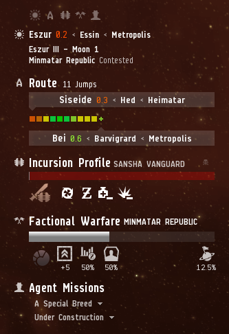
Pop-quiz: What do the Autopilot Route, Current System, Factional Warfare, Incursions, Agent Missions and Planetary Interaction have in common? I’m sure it’s possible to engineer various clever punch lines to that question, but the boring, logical answer is that they all fight to conquer the screen real estate next to the Neocom. To avoid casually referring to them as the user interface widgets that fight to conquer the screen real estate next to the Neocom (it really slows down meetings) we decided to re-brand them as the Info Panels. Even though our uncanny ability to give shorter names to things would easily justify a dev blog on its own, I’m happy to announce that this is not all! As with many other parts of the UI, things have grown somewhat organically here, and we are currently in a situation where the worst case scenario (all panels visible, lowest screen resolution) will fill up the screen vertically, effectively inhibiting us from introducing new panels if needed. Also, there was almost a complete lack of a clear system; some of the panels could be configured, others couldn’t and the aesthetics didn’t really match up so well in many cases. To amend this, we’ve designed and implemented a new mechanism that gives you the power to decide what information is important enough to you, and your play style, to have it in front of you at all times. Also; sexier look and feel.
Configuration
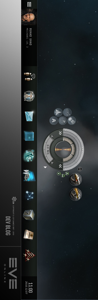
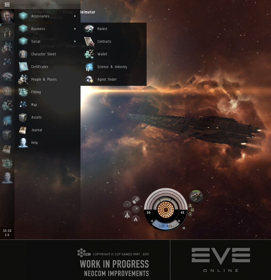
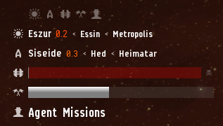
To begin with, each panel now comes in three flavors; normal, compact and collapsed. Normal mode is the most verbose one, compact mode only displays the most relevant stuff, while collapsed mode will minimize the panel to the top icon row, where it can be accessed by hovering over the relevant icon. Going between normal and compact mode is accomplished by single clicking the panel header or the arrow in front of it, while collapsing is done either by double clicking, or single clicking the top row icon. We’ve also introduced the ability to re-order the panels, which is simply done by dragging the top row icons around.
We are also recognizing that the importance of information is highly scope specific. What I mean by that is that information that’s relevant to you while your viewing the space scene, may not be important at all while you’re, say, navigating the map, or clicking around in PI, and vice versa. Hence, the info panel configurations are view state specific, meaning that your configurations are persisted per view (the different views include station, space, PI, map, etc.). We have designed what we think are good defaults for each view state, but there is absolutely no need for you to agree with that verdict since configuration is so easy.
That’s fine, now get to the new features
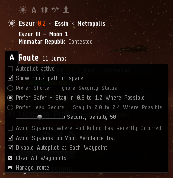
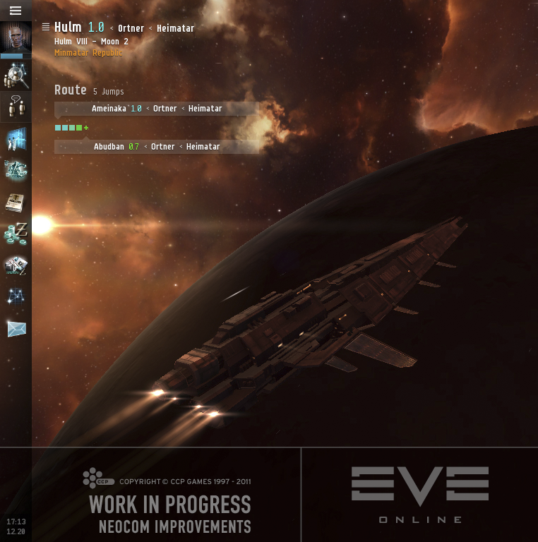
Sure thing, boss. While we were mainly focused on getting the old content into a shiny new system, we did manage to drag in some cool new stuff, the most significant thing arguably being the migration of the autopilot settings from a place that makes practically no sense at all (the map panel) over to a place that actually does (the new Autopilot Route Info panel). As a result, the old routine of multiple clicks, confusion and moderate swearing has been replaced with a single click. We must admit that we were very tempted to do a more extensive cleanup of how you manage the autopilot route (see mockup below) but that will have to wait its turn.
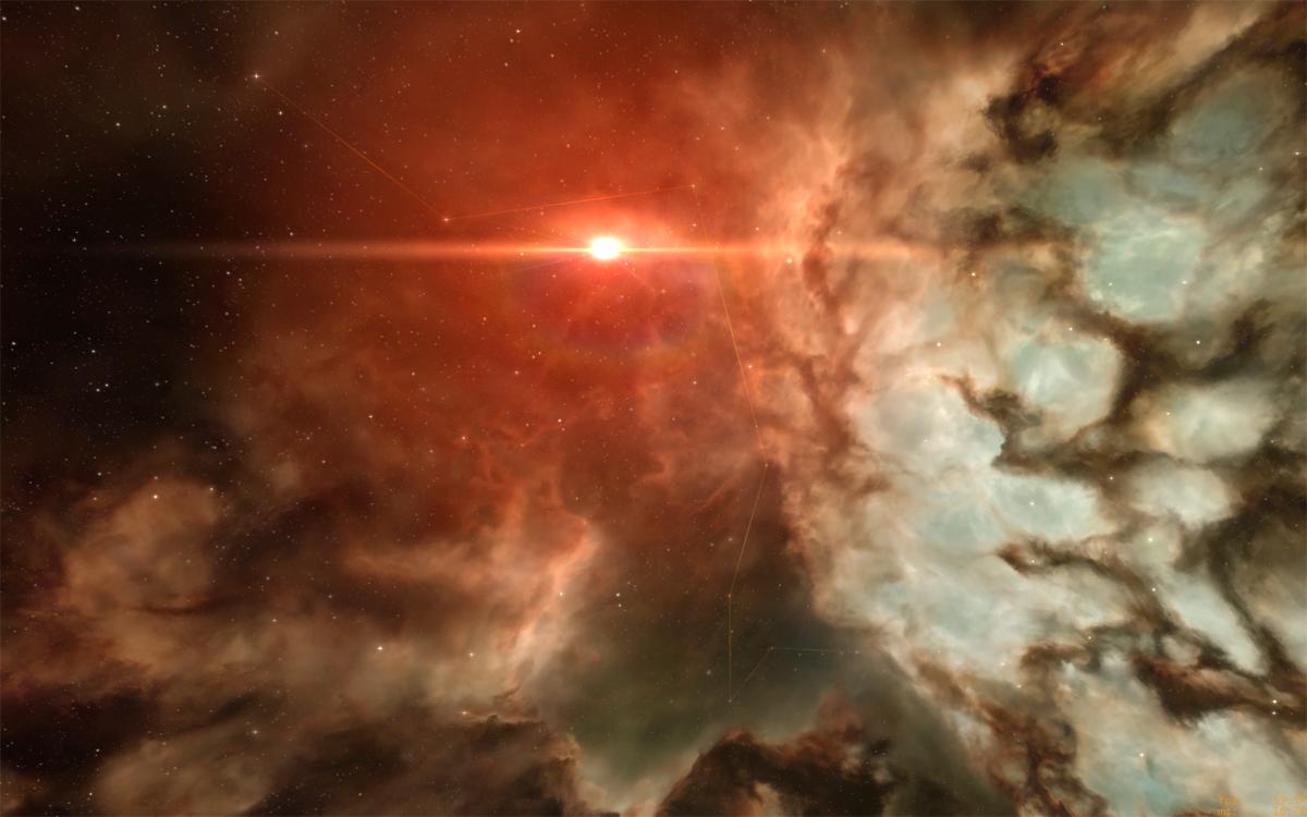
Another neat new feature, which is toggled through the new autopilot settings menu by selecting “Show route path in space”, will reveal one of our best kept secrets; the stars in the space scene nebula actually represent the solar systems of New Eden. By plotting the route in space you’ll feel more like you’re actually travelling through space while burning up your route, rather than just appearing at arbitrary locations. In the near future we’re hoping to add some neat stuff to this feature such as making the stars interactive. Also, we (as in Team Game of Drones) didn’t really do any of the hard route plotting work. CCP Mannapi did. We’re just here to rob the credit. That’s how we roll.
Other minor tweaks include clearer, more iconic icons, smoother animations and improved UI layouts.
More later
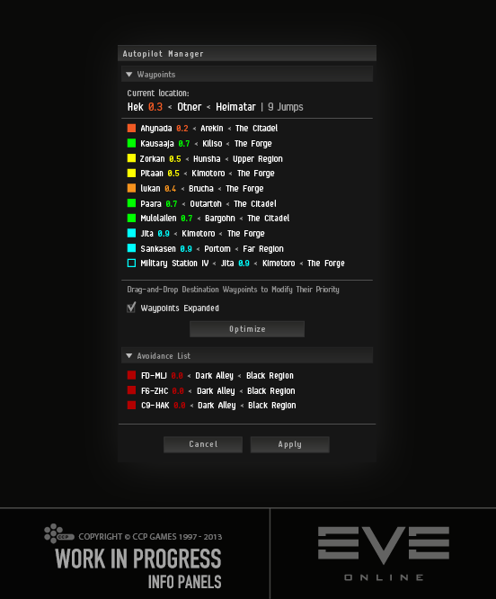
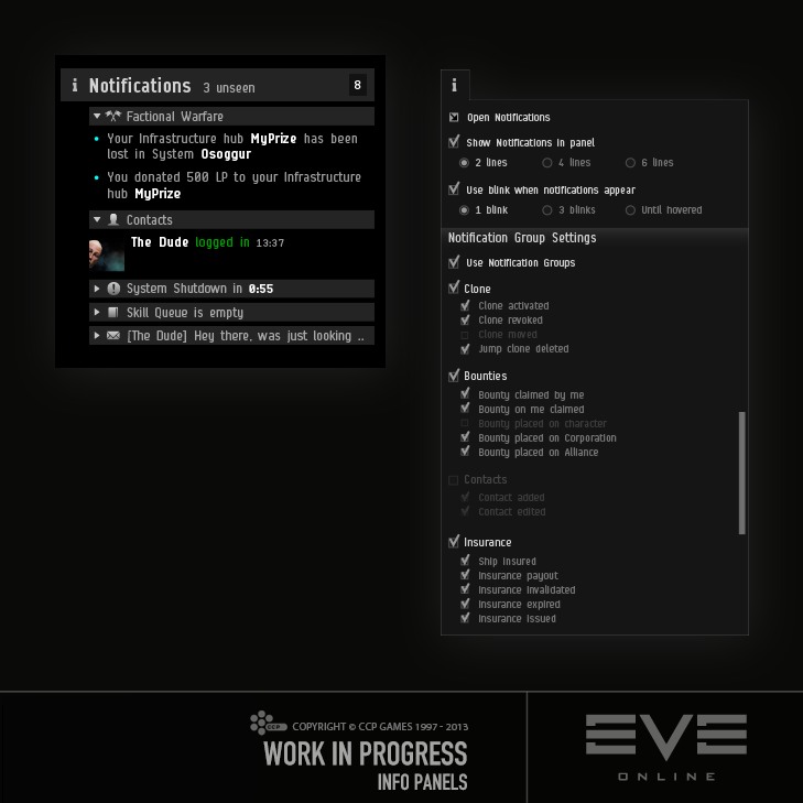
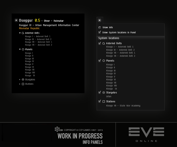
Finally, I might tease you that we’re already plotting to do more Info Panel work in the future, both introduce completely new ones (a new notifications panel that would allow you to read the headers of all incoming notifications without opening a separate window), improving current ones (adding current system location entries to the System Info panel) as well as migrating old UI over to the new system (map panel anyone?). Here are mockups for some of those; it would be very interesting to hear your thoughts.
The new Info Panels are already live on our test server, Singularity, so please give them a spin and report back to us with your delicious feedback.
Hope you enjoy!
New to EVE? Start your 14-day free trial today.
Returning pilot? Visit Account Management for the latest offers and promotions.